The Problem: Mastering Object-Oriented Matplotlib Through the Four Stages
Core Question: How can we create compelling, professional data visualizations using object-oriented matplotlib and the four stages of visualization?
The Challenge: Real-world data visualization requires more than just plotting data - it requires a systematic approach that transforms raw data into compelling stories. The four stages framework provides a proven methodology for creating visualizations that inform, persuade, and inspire action.
Our Approach: We’ll work with baseball stadium data to investigate whether Coors Field in Denver, Colorado is truly the most run-friendly ballpark in Major League Baseball. This investigation will take us through all four stages of visualization, demonstrating object-oriented matplotlib techniques along the way.
⚠️ AI Partnership Required
This challenge pushes boundaries intentionally. You’ll tackle problems that normally require weeks of study, but with Cursor AI as your partner (and your brain keeping it honest), you can accomplish more than you thought possible.
The new reality: The four stages of competence are Ignorance → Awareness → Learning → Mastery. AI lets us produce Mastery-level work while operating primarily in the Awareness stage. I focus on awareness training, you leverage AI for execution, and together we create outputs that used to require years of dedicated study.
Getting Started: Repository Setup
📁 Getting Started
Step 1: Fork and clone this challenge repository: https://github.com/flyaflya/dataVizChallenge.git
Step 3: You’re ready to start! The data loading code and starter code for the visualizations are already provided in this file.
Note: This challenge uses the same index.qmd file you’re reading right now - you’ll edit it to complete your analysis.
Before publishing: Remove or comment out the “Getting Started” and “Grading and Submission” sections from your final GitHub Pages version so your published page reads as a cohesive Coors Field analysis story.
⚠️ Cloud Storage Warning
Avoid using Google Drive, OneDrive, or other cloud storage for Python projects! These services can cause issues with package installations and virtual environment corruption. Keep your Python projects in a local folder like C:\Users\YourName\Documents\ instead.
💾 Important: Save Your Work Frequently!
Before you start: Make sure to commit your work often using the Source Control panel in Cursor (Ctrl+Shift+G or Cmd+Shift+G). This prevents the AI from overwriting your progress and ensures you don’t lose your work.
Commit after each major step:
After completing each stage section
After adding your visualizations
After completing your advanced object-oriented techniques
Before asking the AI for help with new code
How to commit:
Open Source Control panel (Ctrl+Shift+G)
Stage your changes (+ button)
Write a descriptive commit message
Click the checkmark to commit
Remember: Frequent commits are your safety net!
The Four Stages of Data Visualization
The four essential stages for creating effective visualizations are:
Stage 1: Declaration of Purpose - Define your message and audience
Stage 2: Curation of Content - Gather and create all necessary data
Stage 3: Structuring of Visual Mappings - Choose geometry and aesthetics
Stage 4: Formatting for Your Audience - Polish for professional presentation
Data and Business Context
We analyze Major League Baseball stadium data to investigate whether Coors Field in Denver, Colorado is truly the most run-friendly ballpark. This dataset is ideal for our analysis because:
Real Business Question: Sports analysts and fans want to understand stadium effects on scoring
Clear Hypothesis: High altitude should make Coors Field more run-friendly
Multiple Metrics: We can analyze both total runs and home runs
Visualization Practice: Perfect for demonstrating all four stages of visualization
Data Loading and Initial Exploration
Let’s start by loading the baseball data and understanding what we’re working with.
import matplotlib.pyplot as pltimport pandas as pdimport numpy as npimport seaborn as sns# Load 2010 baseball season datadf2010 = pd.read_csv("baseball10.csv")# Load 2021 baseball season data for comparisondf2021 = pd.read_csv("baseball21.csv")print("2010 data shape:", df2010.shape)print("2021 data shape:", df2021.shape)print("\n2010 data columns:", df2010.columns.tolist())print("\nFirst few rows of 2010 data:")print(df2010.head())
2010 data shape: (2430, 7)
2021 data shape: (2429, 7)

2010 data columns: ['date', 'visiting', 'home', 'visScore', 'homeScore', 'visHR', 'homeHR']

First few rows of 2010 data:
       date visiting home  visScore  homeScore  visHR  homeHR
0  20100404      NYA  BOS         7          9      2       1
1  20100405      MIN  ANA         3          6      1       3
2  20100405      CLE  CHA         0          6      0       2
3  20100405      DET  KCA         8          4      0       1
4  20100405      SEA  OAK         5          3      1       0
💡 Understanding the Data
Baseball Game Data: Contains information about each game, including: - home: Home team (3-letter code) - visiting: Visiting team (3-letter code) - homeScore: Runs scored by home team - visScore: Runs scored by visiting team - homeHR: Home runs by home team - visHR: Home runs by visiting team - date: Game date
Business Questions We’ll Answer: 1. Is Coors Field (COL) the most run-friendly ballpark in 2010? 2. How does this change in 2021? 3. What’s the difference between total runs and home runs by stadium?
Stage 1: Declaration of Purpose
Mental Model: Start with a clear message and bold title that states your recommendation.
Our purpose is to investigate whether Coors Field in Denver, Colorado is truly the most run-friendly baseball stadium in Major League Baseball.
🤔 Discussion Questions: Stage 1 - Declaration of Purpose
Question 1: Hypothesis Formation - Why might high altitude affect baseball performance? Is Coors Field affected by high altitude?
Stage 2: Curation of Content
Mental Model: Gather and create all the data you need to support your message.
Let’s aggregate the data to get average runs per stadium:
# Stage 2: Curation of Content# Aggregate data to get average runs per stadium# Process 2010 dataavgDF_2010 = (df2010 .assign(totalRuns =lambda df: df.homeScore + df.visScore) .assign(totalHR =lambda df: df.homeHR + df.visHR) .drop(columns = ['date', 'visiting']) .groupby(['home'], as_index=False) .mean())# Process 2021 dataavgDF_2021 = (df2021 .assign(totalRuns =lambda df: df.homeScore + df.visScore) .assign(totalHR =lambda df: df.homeHR + df.visHR) .drop(columns = ['date', 'visiting']) .groupby(['home'], as_index=False) .mean())print("2010 Stadium Averages (Top 5):")print(avgDF_2010.head())print("\n2021 Stadium Averages (Top 5):")print(avgDF_2021.head())
🤔 Discussion Questions: Stage 2 - Curation of Content
Question 1: Data Aggregation Strategy - How many games are in the dataset? Why do we aggregate individual games into stadium averages before we start the visualization process?
Stage 3: Structuring of Visual Mappings
Mental Model: Choose the right geometry and aesthetics to effectively communicate your message.
Let’s explore different visual approaches:
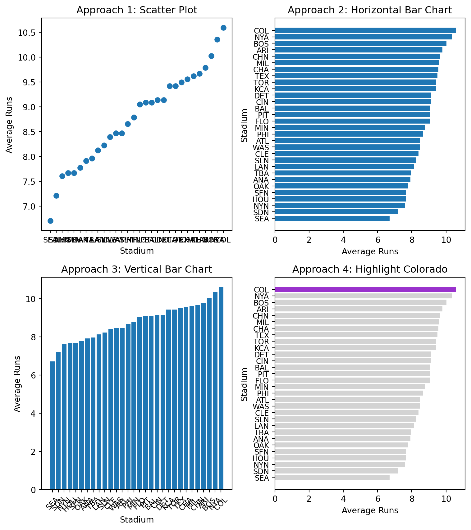
# Stage 3: Structuring of Visual Mappings# Explore different geometries and aesthetics# Sort data for better visualizationavgDF_2010_sorted = avgDF_2010.sort_values('totalRuns', ascending=True)# Create figure with subplots to compare approachesfig, axes = plt.subplots(2, 2, figsize=(8, 9))# Approach 1: Scatter plot (not ideal for categorical data)axes[0,0].scatter(avgDF_2010_sorted.home, avgDF_2010_sorted.totalRuns)axes[0,0].set_title("Approach 1: Scatter Plot")axes[0,0].set_xlabel("Stadium")axes[0,0].set_ylabel("Average Runs")axes[0,0].tick_params(axis='x', labelsize=9)# Approach 2: Horizontal bar chart (better for categorical data)axes[0,1].barh(avgDF_2010_sorted.home, avgDF_2010_sorted.totalRuns)axes[0,1].set_title("Approach 2: Horizontal Bar Chart")axes[0,1].set_xlabel("Average Runs")axes[0,1].set_ylabel("Stadium")axes[0,1].tick_params(axis='y', labelsize=9)# Approach 3: Vertical bar chartaxes[1,0].bar(avgDF_2010_sorted.home, avgDF_2010_sorted.totalRuns)axes[1,0].set_title("Approach 3: Vertical Bar Chart")axes[1,0].set_xlabel("Stadium")axes[1,0].set_ylabel("Average Runs")axes[1,0].tick_params(axis='x', rotation=45, labelsize=9)# Approach 4: Highlight Coloradocolorado_colors = ["darkorchid"if stadium =="COL"else"lightgrey"for stadium in avgDF_2010_sorted.home]axes[1,1].barh(avgDF_2010_sorted.home, avgDF_2010_sorted.totalRuns, color=colorado_colors)axes[1,1].set_title("Approach 4: Highlight Colorado")axes[1,1].set_xlabel("Average Runs")axes[1,1].set_ylabel("Stadium")axes[1,1].tick_params(axis='y', labelsize=9)plt.tight_layout()plt.show()
🤔 Discussion Questions: Stage 3 - Structuring of Visual Mappings
Question 1: Geometry Choices - Why is a horizontal bar chart better than a scatter plot for this data? - When would you choose a vertical bar chart over horizontal?
Question 2: Aesthetic Mappings - What does the color highlighting accomplish in Approach 4? - How does position (x/y) compare to color for encoding data?
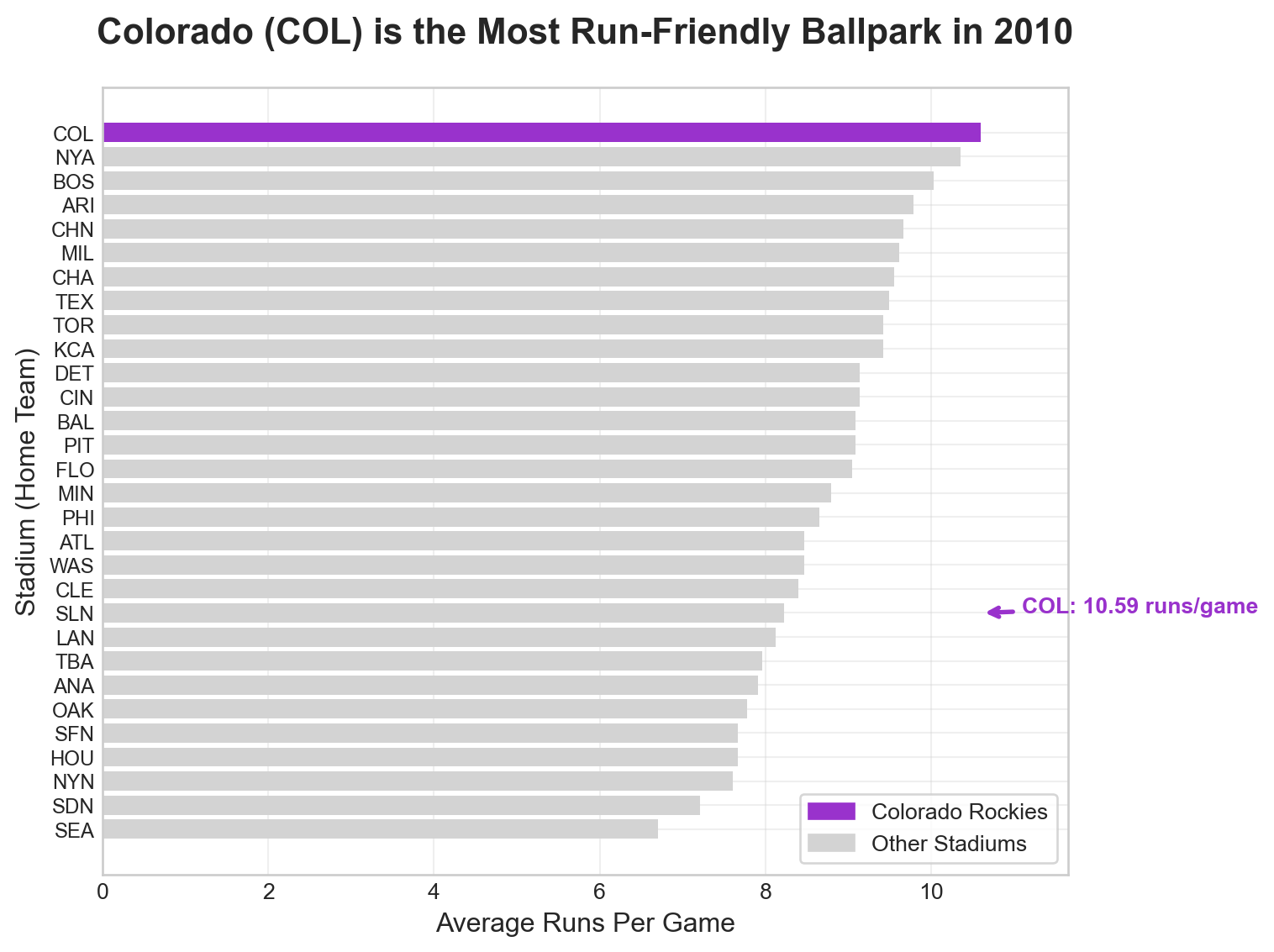
Stage 4: Formatting for Your Audience
Mental Model: Polish your visualization for professional presentation.
Let’s create a publication-ready visualization:
# Stage 4: Formatting for Your Audience# Create a professional, publication-ready visualization# Set style for professional appearanceplt.style.use("seaborn-v0_8-whitegrid")# Create the main visualizationfig, ax = plt.subplots(figsize=(8, 6))# Create color array for highlighting Coloradocolorado_colors = ["darkorchid"if stadium =="COL"else"lightgrey"for stadium in avgDF_2010_sorted.home]# Create horizontal bar chartbars = ax.barh(avgDF_2010_sorted.home, avgDF_2010_sorted.totalRuns, color=colorado_colors)# Add title and labelsax.set_title("Colorado (COL) is the Most Run-Friendly Ballpark in 2010", fontsize=16, fontweight='bold', pad=20)ax.set_xlabel("Average Runs Per Game", fontsize=12)ax.set_ylabel("Stadium (Home Team)", fontsize=12)# Add legendcolorado_bar = plt.Rectangle((0,0),1,1, color="darkorchid", label="Colorado Rockies")other_bar = plt.Rectangle((0,0),1,1, color="lightgrey", label="Other Stadiums")ax.legend(handles=[colorado_bar, other_bar], loc='lower right', frameon=True)# Add annotation for Coloradocolorado_index = avgDF_2010_sorted[avgDF_2010_sorted.home =="COL"].index[0]colorado_runs = avgDF_2010_sorted[avgDF_2010_sorted.home =="COL"]["totalRuns"].iloc[0]ax.annotate(f"COL: {colorado_runs:.2f} runs/game", xy=(colorado_runs, colorado_index), xytext=(colorado_runs +0.5, colorado_index), arrowprops=dict(arrowstyle='->', color='darkorchid', lw=2), fontsize=10, fontweight='bold', color='darkorchid')# Set x-axis to start from 0 for better comparisonax.set_xlim(0, max(avgDF_2010_sorted.totalRuns) *1.1)# Smaller font for stadium (y-axis) tick labelsax.tick_params(axis='y', labelsize=9)# Add grid for easier readingax.grid(True, alpha=0.3)plt.tight_layout()plt.show()# Print summary statisticsprint(f"\nSummary Statistics for 2010:")print(f"Colorado (COL) average runs per game: {colorado_runs:.2f}")print(f"League average runs per game: {avgDF_2010_sorted.totalRuns.mean():.2f}")print(f"Colorado is {((colorado_runs / avgDF_2010_sorted.totalRuns.mean()) -1) *100:.1f}% above league average")
Summary Statistics for 2010:
Colorado (COL) average runs per game: 10.59
League average runs per game: 8.77
Colorado is 20.8% above league average
🤔 Discussion Questions: Stage 4 - Formatting for Your Audience
Question 1: Professional Formatting - What elements make this visualization suitable for a business presentation? - Is the annotation on the visualization helpful? Can you fix its placement?
Advanced Object-Oriented Techniques
Mental Model: Use object-oriented matplotlib to create complex, reusable visualizations.
Let’s create a comprehensive comparison between 2010 and 2021:
# Advanced Object-Oriented Techniques# Create a comprehensive comparison visualization# Prepare data for comparisoncomparison_data = pd.merge( avgDF_2010[['home', 'totalRuns']].rename(columns={'totalRuns': 'runs_2010'}), avgDF_2021[['home', 'totalRuns']].rename(columns={'totalRuns': 'runs_2021'}), on='home', how='inner')## TODO: Create the visualization
Question 1: Using Subplot Layout - Create a two-facet visualization that shows the total runs for 2010 and 2021 for each stadium in a single figure. Highlight Colorado in the visualization.
Question 2: Explanation of the Visualization - Ask AI To Add A Paragraph Here To Explain The Visualization - Does AI come to the right conclusion? If not, why not?
Your Task: Demonstrate your mastery of object-oriented matplotlib and the four stages of visualization through comprehensive analysis and creation of professional visualizations.
Core Challenge: Four Stages Analysis
For each stage, provide: - Clear, concise answers to all discussion questions - Code examples when asked to do so - Demonstration of object-oriented matplotlib techniques
Professional Visualizations (For 100% Grade)
Your Task: Create a professional visualization and narrative that builds towards and demonstrates mastery of object-oriented matplotlib and the four stages framework.
Create visualizations showing: - Stadium run-friendliness comparison between 2010 and 2021 - Focus on Colorado’s performance relative to other stadiums - Use object-oriented matplotlib techniques throughout
Your visualizations should: - Use clear labels and professional formatting - Demonstrate all four stages of visualization - Be appropriate for a business audience - Show mastery of object-oriented matplotlib - Do not echo the code that creates the visualizations
Grading and Submission
Submission Checklist:
Grading:
Grade
Requirements
Minimum
Discussion questions for at least 3 of 4 stages; working GitHub Pages site
85%
All 4 stages with comprehensive, well-reasoned responses
100%
All discussion questions plus professional visualizations demonstrating mastery
Report Quality: Professional writing, concise analysis, clear demonstration of object-oriented matplotlib.