DAFT Package Challenge

Recreating the Scurvy DAGs with Beautiful Visualizations

🎨 DAFT Package Challenge - Recreating the Scurvy DAGs

📊 Challenge Requirements In Section Student Analysis Section
  • Recreate all three scurvy DAGs using DAFT programming
  • Optional: Demonstrate understanding of DAFT customization options

The Problem: Mastering Probabilistic Graphical Models with DAFT

Core Question: How can we use the DAFT package to create visually appealing Directed Acyclic Graphs (DAGs) that tell a compelling data story?

The Challenge: You’ll recreate three historical DAGs depicting the fascinating story of how we lost and rediscovered the cure to scurvy. This challenge teaches you to use DAFT for creating professional-quality probabilistic graphical models.

Our Approach: We’ll work through the three different understandings of the scurvy data generating process, learning DAFT customization techniques while exploring a crucial moment in medical history.

⚠️ AI Partnership Required

This challenge pushes boundaries intentionally. You’ll tackle problems that normally require weeks of study, but with Cursor AI as your partner (and your brain keeping it honest), you can accomplish more than you thought possible.

The new reality: The four stages of competence are Ignorance → Awareness → Learning → Mastery. AI lets us produce Mastery-level work while operating primarily in the Awareness stage. I focus on awareness training, you leverage AI for execution, and together we create outputs that used to require years of dedicated study.
The Scurvy Story: A Data Science Tragedy

Scurvy was a devastating disease that affected sailors on long voyages. The cure was discovered in 1747, but due to a misunderstanding about the cause, the cure was lost for over 150 years. The story involves three different understandings of the data generating process:

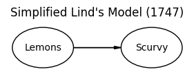
  1. 1747 Understanding: Lemons prevent scurvy (correct but incomplete!)
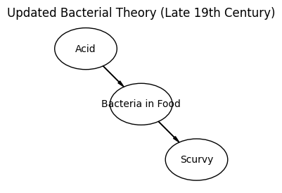
  2. Misguided Belief: Acid kills bacteria that causes scurvy (wrong!)
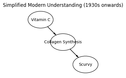
  3. 1928 Understanding: Vitamin C prevents scurvy (the real mechanism)

Environment Setup

First, let’s install the DAFT package and set up our environment:

# Install DAFT package (run this in terminal if not already installed)
# pip install 'daft-pgm'

import daft
import matplotlib.pyplot as plt
import numpy as np

# Set up plotting parameters for better quality
plt.rcParams['figure.dpi'] = 150
plt.rcParams['savefig.dpi'] = 300

print("DAFT package imported successfully!")
print("Ready to create beautiful DAGs!")
DAFT package imported successfully!
Ready to create beautiful DAGs!
💡 Understanding DAFT

DAFT (Directed Acyclic Factor Graphs Toolkit) is a Python package for creating probabilistic graphical models. It’s particularly useful for:

  • Creating Directed Acyclic Graphs (DAGs)
  • Visualizing causal relationships
  • Communicating data generating processes
  • Creating publication-quality figures

Key DAFT Concepts:

  • Nodes: Represent variables or factors
  • Edges: Show relationships between variables
  • Plates: Indicate repeated structures
  • Styling: Customize colors, shapes, and formatting

The Three DAGs: Your Mission

Your task is to recreate these three historical DAGs using DAFT, making them visually appealing and professionally formatted.

DAG 1: The 1747 Understanding (Correct but Incomplete)

Historical Context: In 1747, James Lind discovered that lemons prevent scurvy through a controlled experiment. However, the understanding was incomplete - they knew lemons worked but not why.

Your Task: Recreate this DAG showing the relationship between lemons and scurvy prevention.

Reference Image:

# TODO: Replace this placeholder with your DAFT code
# Create a DAG showing the 1747 understanding: Lemons → Scurvy Prevention

# Your code here - recreate the DAG from the reference image
# Use DAFT to create nodes and edges that match the visual structure
# Customize colors and styling to make it professional

DAG 2: The Misguided Belief (Wrong Understanding)

Historical Context: Over time, people came to believe it was the acid in lemons that killed bacteria which was causing scurvy. This led to lemons being replaced by limes (cheaper but less Vitamin C) or just using acids like vinegar, causing scurvy to return.

Your Task: Recreate this DAG showing the incorrect understanding of the data generating process.

Reference Image:

# TODO: Replace this placeholder with your DAFT code
# Create a DAG showing the misguided belief: Acid → Bacteria Death → Scurvy Prevention

# Your code here - recreate the DAG from the reference image
# This DAG should show the incorrect causal chain
# Use different colors or styling to indicate this is the wrong understanding

DAG 3: The 1928 Understanding (Complete and Correct)

Historical Context: In 1928, the true mechanism was discovered - it was Vitamin C (ascorbic acid) that prevented scurvy. This complete understanding finally explained why lemons worked and why the acid theory was wrong.

Your Task: Recreate this DAG showing the complete and correct understanding of the scurvy data generating process.

Reference Image:

# TODO: Replace this placeholder with your DAFT code
# Create a DAG showing the 1928 understanding: Vitamin C → Scurvy Prevention

# Your code here - recreate the DAG from the reference image
# This should be the most complete and accurate representation
# Use professional styling that would be suitable for a scientific publication

Student Requirements Section: Mastering DAFT Visualization

Your Task: Demonstrate your mastery of DAFT through comprehensive recreation of the three scurvy DAGs and thoughtful analysis. The bulk of your grade comes from successfully recreating the DAGs and answering the discussion questions.

📊 Challenge Requirements

Complete all DAG recreation sections:

  1. DAG 1 (1747): Lemons prevent scurvy - correct but incomplete
  2. DAG 2 (Misguided): Acid kills bacteria - wrong understanding
  3. DAG 3 (1928): Vitamin C prevents scurvy - complete and correct
  4. Optional: Add a little professional styling to the DAGs to make them more visually appealing (example: use nice fill colors and/or enclose the text in the ellipse completely).

Professional Quality Standards

Your DAGs should:

  • (90% grade): Accurately recreate the reference images
  • (100% grade): Add professional colors and possibly play with shapes to make it more visually appealing (example: use nice fill colors and/or enclose the text in the ellipse completely). Erase everything but the story of scurvy and the three DAGs
  • Include clear, readable labels
  • Demonstrate understanding of DAFT customization options
  • Be suitable for a business or academic audience

Example: Professional DAFT Node Styling

Here’s an example (see Figure 1) of how to create a professionally styled node in DAFT with nice captions and references to the figure:

import daft
import matplotlib.pyplot as plt

# Create a PGM object
pgm = daft.PGM(dpi=150, alternate_style="outer")

# Example of a professionally styled node
pgm.add_node("vitamin_c", "Vitamin C\nIntake" + r" $(X)$", 1, 1, aspect = 3, scale = 1.1,
             plot_params={
                 'facecolor': 'lightgreen', 
                 'edgecolor': 'darkgreen', 
                 'linewidth': 2,
                 'alpha': 0.8,
             })
pgm.add_node("health", "Healthiness\n"+r" $(Y)$", 3.25, 1, aspect = 3, scale = 1.1,
             plot_params={
                 'facecolor': 'thistle', 
                 'edgecolor': 'purple', 
                 'linewidth': 2,
                 'alpha': 0.8,
             })
pgm.add_edge("vitamin_c", "health")

pgm.render()
Figure 1: Example: Professional DAFT Node Styling

Key Styling Parameters:

  • facecolor: Background color of the node
  • edgecolor: Border color of the node
  • linewidth: Thickness of the border
  • alpha: Transparency (0.0 to 1.0)
  • fontsize: Size of text inside the node
  • aspect: Width/height aspect ratio of the node (default: 1.0)
  • scale: Height of the node (default: 1.0)

Getting Started: Repository Setup 🚀

📁 Getting Started

Step 1: Create a new repository in your GitHub account named “daftChallenge” (forked from https://github.com/flyaflya/daftChallenge)

Step 2: Clone your repository locally using Cursor (or VS Code)

Step 3: Be sure to install DAFT in your environment: pip install 'daft-pgm'.

Step 4: Modify your local copy of this index.qmd file to complete the challenge and get it to be a github pages website.

Getting Started Tips

Key DAFT Resources

Essential DAFT Documentation:

Key DAFT Parameters to Explore:

  • plot_params: Dictionary of matplotlib parameters for styling
  • aspect: Controls node width (default: 1.0)
  • scale: Controls node size (default: 1.0)
  • fontsize: Text size in the node
  • alternate: Use alternative node shape (True/False)

Grading Rubric 🎓

90% Grade: Successfully recreate all 3 DAGs with good visual quality.

100% Grade: Recreate all 3 DAGs with enhanced quality and visual aesthetics (example: use nice fill colors and/or enclose the text in the ellipse completely).

Submission Checklist ✅

Minimum Requirements (Required for Any Points):

90% Grade Requirements:

100% Grade Requirements: