Recovering Lost Figures: Visualizing Confounders and Causal Inference
📋 The Challenge: Recover the Lost Figures!
A critical report on confounding and causal inference was being prepared when disaster struck—the figures were lost! The data files survived (patients_data.csv and patients_data_randomized.csv), and the narrative text is intact, but all three key visualizations have disappeared.
Your mission: Recover the lost figures by reading the narrative carefully and creating compelling visualizations that match the story being told. The figures must be:
Figure 1: Post-surgical outcomes by patient (observational data)
Figure 2: Post-surgical outcomes for randomized patients
Figure 3: Post-surgical outcomes by patient severity (stratification)
Use the text descriptions, statistical results, and your understanding of visualization best practices to recreate these figures. Your figures should be professional, colorblind-friendly, and tell the story clearly.
Grading: Completing the three figures correctly will earn you 85% of the grade. To earn the final 15% (for a total of 100%), you must make it feel like a complete, professional report rather than a challenge assignment
⚠️ AI Partnership Required
Use Cursor AI for speed, but ensure you understand and can explain your visualizations in your own words. The goal is to create figures that match the narrative and statistical insights described in the text.
Imagine you need to choose between two surgeons of similar rank at the same hospital. The first surgeon, Doc Dreamy, matches our stereotype perfectly: refined appearance, silver-rimmed glasses, delicate hands, measured speech, and an office adorned with Ivy League diplomas (see the image). The second surgeon, Doc Duck, by contrast, looks more like a butcher—overweight, with large hands, an unkempt appearance, and no visible credentials on the wall.
Counterintuitively, the surgeon who doesn’t “look the part” may actually be the better choice. Why? Because when someone succeeds in their profession despite not fitting the expected appearance, it suggests they had to overcome significant perceptual biases. And if we are lucky enough to have people who do not look the part, it is thanks to the presence of some skin in the game, the contact with reality that filters out incompetence. (Taleb 2017)
Observational Data: A Misleading Victory for Doc Dreamy
import pandas as pd# Load the observational datapatients_df = pd.read_csv('patients_data.csv')# Display first few rows to understand the structureprint(f"Number of patients: {len(patients_df)}")
# Load the observational datapatients_df <-read.csv('patients_data.csv')# Display first few rows to understand the structurecat("Number of patients:", nrow(patients_df), "\n")
Let’s use data to figure out which surgeon performs better. ?@fig-plot-outcomes shows the post-surgical symptom score for 100 patients. Doc Duck’s average post-surgical symptom score is 3.38 while Doc Dreamy’s average is 2.8. Doc Dreamy performs better since lower scores indicate better outcomes. One might ask if the difference in average post-surgical symptom score is statistically significant. A two-sample t-test reveals a statistically significant difference (t = -2.317, p = 0.023).
Your task: Create a scatter plot showing post-surgical symptom scores by patient number, with different markers/colors for each doctor. The figure should include:
Scatter points for each patient (Doc Dreamy: circles, Doc Duck: triangles)
Horizontal dashed lines showing the mean for each doctor
Text annotations showing the mean values with shape symbols (○ for Doc Dreamy, △ for Doc Duck)
Colorblind-friendly colors (blue for Doc Dreamy, coral/red-orange for Doc Duck)
Professional styling: clear labels, grid, legend, appropriate font sizes
X-axis: Patient Number
Y-axis: Post-Surgical Symptom Score (Lower is Better)
Title: “Post-Surgical Symptom Score by Patient and Doctor”
# TODO: Recover Figure 1 - Post-surgical outcomes by patient# Load data (already loaded above)# Create scatter plot with:# - Different markers for each doctor (circles vs triangles)# - Colorblind-friendly colors# - Mean lines and annotations# - Professional styling# Hint: Use matplotlib object-oriented style (fig, ax = plt.subplots())# Colors: Doc Dreamy = '#4E79A7' (blue), Doc Duck = '#E15759' (coral/red-orange)
# TODO: Recover Figure 1 - Post-surgical outcomes by patient# Load data (already loaded above)# Create scatter plot with ggplot2 or base R# Include:# - Different shapes for each doctor# - Colorblind-friendly colors# - Mean lines and annotations# - Professional styling# Hint: Use ggplot2 for professional plots# Colors: Doc Dreamy = '#4E79A7' (blue), Doc Duck = '#E15759' (coral/red-orange)
The Hidden Confounder: Patient Severity Explains It All
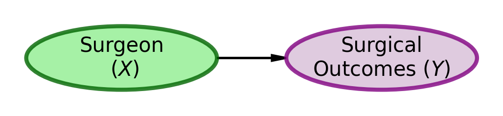
As readers of ?@fig-plot-outcomes, the easiest path for our brains is to accept the mental model of surgical outcomes depicted in Figure 1.
Figure 1: DAG Model Explaining Surgical Outcomes
The obvious conclusion from using the mental model of Figure 1 and the data shown in ?@fig-plot-outcomes is that Doc Dreamy is the superior surgeon because his patients’ scores are lower than Doc Duck’s patients’ scores.
However, a “common cause” confounder can create an association between \(X\) and \(Y\) that is not causal in nature. For example, if \(X\) is puddles on the road and \(Y\) is people with umbrellas, it does not mean that the puddles cause people to have umbrellas. Instead, a common cause for both, namely rain (\(Z\)), is the sole reason for the observed association. The presence of rain causes both puddles and people to carry umbrellas, creating a spurious correlation between the two.
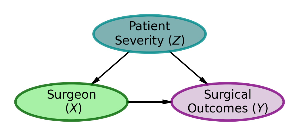
As Nassim Taleb hints, there may be an alternate explanation. Consider the model shown in Figure 2. Might there be an unaccounted for common cause that is causing the association between surgeon choice and surgical outcomes?
Figure 2: DAG Model Explaining Surgical Outcomes
A possible common-cause story would go something like this. Both surgeons have full schedules, with Dr. Dreamy scheduling surgeries 3 weeks in advance and Dr. Duck scheduling surgeries 1 week in advance. As such, patients who are not in a rush, usually those with low severity, are more likely to choose Dr. Dreamy based on his website and picture. However, patients who are in more of a rush, usually those with high severity, are more likely to choose Dr. Duck based on his availability and the fact that he is the only surgeon who can see them immediately.
Assumption: Slow Progression of Patient Severity
For simplicity, we assume that patient severity progresses slowly enough that a 2-week delay (i.e., waiting for Dr. Dreamy’s availability) has zero effect on surgical outcomes. This delay affects only how quickly patients receive surgical relief, not the eventual outcome itself. While time-to-surgery can be an important factor in other contexts, here we focus solely on whether initial patient severity might create a spurious or biased association between surgeon choice and outcomes.
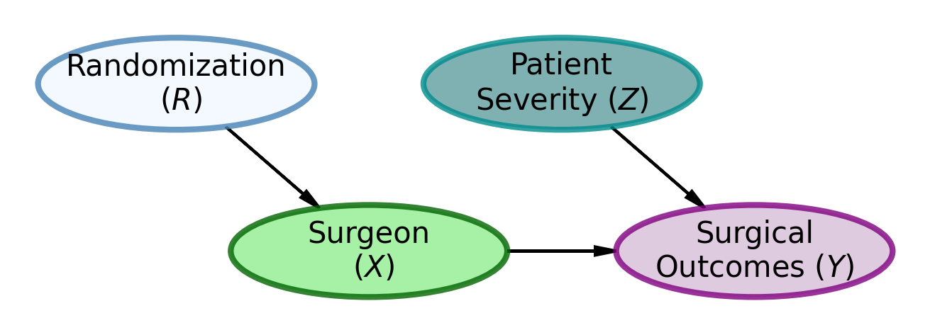
Solution 1: Randomization — Break the Confounding Path
The gold standard to establish causation is a randomized controlled trial. Instead of letting patients choose their surgeon, we randomly assign them to either Dr. Dreamy or Dr. Duck.
This is precisely the kind of problem randomization can solve. By randomly assigning patients to surgeons, we break the potential confounding relationship where patient severity ends up correlated with choice of surgeon. Since assignment is now random rather than based on patient choice between a good-looking doctor and a doctor available more quickly, we eliminate this confounding pathway. This break, pictured in Figure 3, allows us to assess whether surgeon identity truly matters for surgical success, or if the observed association was merely due to patient severity influencing both surgeon choice and outcomes.
Figure 3: DAG Model Explaining Surgical Outcomes
Figure 3 shows the DAG model for the randomization scenario. In this scenario, patient severity (\(Z\)) is no longer a cause of surgeon choice (\(X\)). Instead, randomization (\(R\)) completely determines surgeon assignment (\(X\)). This breaks the confounding relationship between patient severity and surgeon choice, allowing us to assess whether the surgeons themselves truly matter for surgical outcomes.
Our data doesn’t have counterfactuals, how can we know what would have happened to those patients if we had randomized?
What is a counterfactual?
A counterfactual is the answer to a “what if” question: what would have happened if circumstances had been different? Specifically, what would each patient’s outcome have been if they had been assigned to the other surgeon, holding everything else constant? These are the unobserved alternative outcomes—the outcomes that didn’t happen but could have happened under different treatment assignment.
Unfortunately, we can’t observe what didn’t happen. The patients we already observed went to the surgeon they chose (or who was available), and we’ll never know their outcomes under the alternative assignment. This is the fundamental problem of causal inference: we only see one world, not the parallel universe where everything else was held constant but the treatment differed.
Since we cannot rerun history with randomization, we run an experiment to collect the data we need. So, we randomly assigned a sequence of 100 patients to either Dr. Dreamy or Dr. Duck and observed the following data:
import pandas as pd# Load the randomized datapatients_randomized_df = pd.read_csv('patients_data_randomized.csv')# Display first few rowsprint(f"Number of randomized patients: {len(patients_randomized_df)}")
# Load the randomized datapatients_randomized_df <-read.csv('patients_data_randomized.csv')# Display first few rowscat("Number of randomized patients:", nrow(patients_randomized_df), "\n")
?@fig-plot-outcomes-randomized shows the post-surgical symptom score for 100 patients under randomized assignment. Doc Duck’s average post-surgical symptom score is 2.71 while Doc Dreamy’s average is 3.46. Doc Duck performs better since lower scores indicate better outcomes. With randomization breaking the confounding relationship, we can now properly assess the causal effect. A two-sample t-test reveals a statistically significant difference (t = 2.734, p = 0.007). Not only is Dr. Dreamy not the better surgeon, he is actually the worse surgeon!
Your task: Create a scatter plot similar to Figure 1, but for the randomized data. The figure should show how randomization breaks the confounding relationship. Include:
Same styling as Figure 1 (markers, colors, mean lines, annotations)
Title should indicate this is randomized assignment
# TODO: Recover Figure 2 - Randomized assignment outcomes# Load randomized data (already loaded above)# Create scatter plot similar to Figure 1# Use same styling and color scheme# Title: "Post-Surgical Symptom Score (Randomized Assignment)"
# TODO: Recover Figure 2 - Randomized assignment outcomes# Load randomized data (already loaded above)# Create scatter plot similar to Figure 1# Use same styling and color scheme
Solution 2: Stratification — When You Can’t Randomize
The key to handling a common cause confounder is to stratify by the common cause. In general, this means we examine the relationship between treatment and outcome within groups that share the same value of the confounder. In our example, this means we look at patients of similar severity and compare the outcomes of the surgeons for patients of similar severity. There are mathematically sophisticated ways to do this, but here we demonstrate it visually. Since patient number lacks inherent meaning, the following figure shows patient severity on the x-axis and post-surgical symptom score on the y-axis.
Your task: Create a scatter plot showing post-surgical outcomes as a function of initial patient severity. This figure demonstrates the power of stratification. Include:
X-axis: Initial Patient Severity
Y-axis: Post-Surgical Symptom Score (Lower is Better)
Scatter points colored/marked by doctor (same scheme as previous figures)
Mean horizontal lines for each doctor
A rectangular overlay (shaded region) highlighting severity between -1 and 1
Text annotations for means positioned appropriately
Title: “Post-Surgical Symptom Score by Patient Severity”
This figure should reveal the confounding by showing how severity affects both surgeon assignment and outcomes
# TODO: Recover Figure 3 - Outcomes by patient severity (stratification)# Load observational data (already loaded above)# Create scatter plot with:# - X-axis: Initial Patient Severity# - Y-axis: Post-Surgical Symptom Score# - Same color/marker scheme as previous figures# - Mean lines and annotations# - Shaded region from -1 to 1 on x-axis (use ax.axvspan or similar)# - Professional styling# Hint: Use axvspan(-1, 1, alpha=0.15, color='gray', zorder=0) for the overlay
# TODO: Recover Figure 3 - Outcomes by patient severity (stratification)# Load observational data (already loaded above)# Create scatter plot with:# - X-axis: Initial Patient Severity# - Y-axis: Post-Surgical Symptom Score# - Same color/marker scheme as previous figures# - Mean lines and annotations# - Shaded region from -1 to 1 on x-axis# - Professional styling
Looking at ?@fig-plot-outcomes-severity, the value of stratifying by severity is visually most obvious with initial patient severity scores between -1 and 1 (highlighted in the overlay). We chose this region because it shows substantial overlap between the two surgeons—both surgeons have considerable data within this range, making it an ideal region for comparing their performance. Outside of this range, there is less data available for making direct comparisons: Doc Duck sees more of the higher-severity patients (severity > 1), while Doc Dreamy sees more of the lower-severity patients (severity < -1).
Within the highlighted region, Doc Dreamy’s blue circles tend to be higher (worse) than Doc Duck’s red triangles for these patients. It is also obvious that Doc Duck is seeing the more severe patients overall, as his red triangles are generally to the right of Doc Dreamy’s blue circles on the x-axis. This is exactly what we would expect if patient severity were a common cause of surgeon choice and surgical outcomes. Despite the aggregate statistics pointing to Doc Dreamy having lower (better) post-surgical symptom scores on average, our visual analysis of this overlapping region leads us to conclude that Doc Duck is actually the better surgeon—a conclusion that would be obscured if we only looked at the means without stratifying by severity.
How to Solve the Confounder Challenge
Here’s the problem with graphs and statistics in general: the numbers can easily mislead you. Or rather, you can be misled by the numbers when you don’t understand what they’re really telling you.
When you just look at the raw data and ask who had better outcomes, Doc Dreamy wins. Lower scores look great on paper. But here’s where it gets important: that association doesn’t mean what you think it means. Correlation is not causation, and we all know that, but we forget it every single time because our brains are wired to see patterns and assign causes.
The real villain here is patient severity. It operates like a puppeteer behind the curtain, making Doc Dreamy look good by sending him easier cases while sending Doc Duck the harder ones. When you don’t randomize, you can’t tell the difference between “Doc Dreamy is a better surgeon” and “Doc Dreamy got lucky with his patient assignment.” On any graph or in any headline, look for the common-cause-confounder villian that is unaccounted for.
Randomization is an excellent defense against this kind of confounding. Flip a coin, assign patients randomly, and suddenly the puppeteer loses control. Now you can actually see who the better surgeon is. And the surprise is that it’s the one who doesn’t look the part. The data wasn’t lying; it was just answering a different question than you thought you were asking.
If you can’t randomize, and that’s most of the time, you stratify. Look within groups of similar patient severity. Compare apples to apples, not apples to oranges. It’s more work, and it’s less satisfying than a clean randomized trial, but it’s better than being fooled by confounding.
The take-home lesson: The world is messy, and the numbers will mislead you if you let them. But if you understand the structure of the problem, if you draw the DAG and think about what causes what, you can defend yourself against being fooled. Randomization when you can, stratification when you can’t. The tools are simple. The hard part is remembering to use them.
Professional Presentation Guidelines
Clear narrative: Your figures should tell the story described in the text
Consistent styling: All three figures should use the same color scheme and styling approach
Colorblind-friendly: Use the specified colors (#4E79A7 for Doc Dreamy, #E15759 for Doc Duck)
Professional quality: Clear labels, appropriate fonts, grid lines, legends
Match the narrative: Your figures should illustrate the points made in the text about confounding, randomization, and stratification
Submission Checklist ✅
For 85% (Base Grade):
For Final 15% (Bonus - 100% Total):
Tips
Read the narrative carefully—it contains hints about what each figure should show
Use the statistical results mentioned in the text to verify your figures are correct
Keep styling consistent across all three figures
Test with both R and Python code chunks if you want to show versatility
Set random seeds if you’re doing any additional analysis for reproducibility